Harman RCP Smartwatch App

Harman RCP watch app enables patient to keep their health and activity under monitoring for better healthcare and fitness outcomes. Watch app runs on Wear OS based devices like Samsung Watch 4, 5 & 6. Patient's all vitals, activities and exercises gets synced with RCP platform and mobile app. This proved helpful majorly for the post hospitalization monitoring of the patients from home and sharing data to physicians remotely so that necessary modifications in the care plan can be done.

My role
I worked as the UX Designer, responsible for redesigning the Harman RCP smartwatch experience by understanding product and medical requirements, conducting quick research, and translating insights into intuitive flows. I focused on WCAG accessibility, clear vitals visibility, and ease of use on small screens, while closely collaborating with product managers and developers to ensure feasible and accurate implementation.
Timeline
Jul 2023 - Aug 2024
Team
Product Manager, Developers, and UI/UX Designer (me), Design manager
Sector
Health, Fitness
Tools
Figma
Impact
Reduced time to check vitals and activity data through a clearer information hierarchy and glanceable layouts
Lowered cognitive load for patients by simplifying health data and minimizing interaction steps
Improved consistency between smartwatch, mobile app, and RCP platform for a seamless monitoring experience
Enhanced accessibility and readability with better contrast, text sizing, and intuitive interactions
Supported remote patient monitoring by enabling reliable data sharing with physicians
Challenges
The challenge was to ensure that patients could clearly understand their health data on a small smartwatch screen without feeling overwhelmed or confused. Important vitals needed to be visible at a glance, easy to read, and simple to navigate, especially for patients monitoring their recovery after hospitalization. Balancing clarity, accessibility, and medical accuracy within the limitations of Wear OS devices made this a key design challenge.
Results
The result was a simplified and more intuitive smartwatch experience where patients could quickly check their vitals and activity data with minimal effort. Improved visual hierarchy, better readability, and accessible design choices helped users feel more confident while monitoring their health, while seamless data syncing enabled doctors to remotely track progress and adjust care plans when needed.
Constraints & Considerations
Small smartwatch screen size limited how much information could be shown at once
Needed clear readability, good contrast, and simple interactions aligned with WCAG accessibility
Health data had to be accurate, easy to understand, and quick to access
Design had to work within Wear OS guidelines and device constraints
Required smooth and reliable data syncing with the mobile app and RCP platform
Close coordination with developers to ensure designs were technically feasible
Insights
Patients need to understand their health data at a glance, especially on small devices like smartwatches. Simplicity, clarity, and
accessibility matter more than showing too much information. Close collaboration with doctors, product managers, and
developers is essential when designing for healthcare and medical accuracy.
Process
02
Information Architecture
We conducted user interviews, surveys, and analyzed in-app analytics to understand the pain points and user needs. We also studied competitor apps and industry trends to gather insights
03
Wireframing & Prototyping
We conducted user interviews, surveys, and analyzed in-app analytics to understand the pain points and user needs. We also studied competitor apps and industry trends to gather insights
04
Usability Testing
We conducted user interviews, surveys, and analyzed in-app analytics to understand the pain points and user needs. We also studied competitor apps and industry trends to gather insights
05
Visual Design & Style Guide
We conducted user interviews, surveys, and analyzed in-app analytics to understand the pain points and user needs. We also studied competitor apps and industry trends to gather insights
Old designs

User Flow

Moodboard
A vibrant mood board has come to life, drawing inspiration from the dynamic world of fitness, diverse sports, and a spectrum of activities dedicated to cultivating a healthy lifestyle.

Design System
Colors - I've strategically chosen contrasting colors against the background to really highlight key information. Additionally, I've opted for darker themes to ensure that the content remains effortlessly readable, especially when viewed outdoors.

Typography - I've chosen a font size and style that works well with the system font for readability. Sticking to one font enhances our brand identity. To show content hierarchy, I've used different styles and weights in the same font family.

Iconography - I've designed icons with in circle for a simple and clear look. The container acts as a background, ensuring users can easily distinguish each icon. I've opted for bold colors without gradation or intricate patterns. Using white for the icons works effectively, standing out against various background colors for optimal visibility.

Grid - I've organized content on square and rectangular screens with grids. On circular screens, I've adapted to the absence of corners, optimizing space within the circle's grid for text and images

Hi-Fi Prototype
Home
The home screen provides quick access to vital health metrics, daily activity tracking, workout options, health questionnaires, medication management, and device settings for user customization and convenience.
Vitals
Workout
Activity
Login
The watch login feature offers three methods: "Login Using App" for syncing with a smartphone app, "Login Using Portal" for direct web access, and "Manual Login" allowing users to enter credentials on the watch. These options provide flexibility and cater to various user preferences.
Watch Faces
Watch faces vary widely, offering classic analog, digital minimalism, fitness tracking, smart customization, photo backgrounds, animations, gaming themes, professional styles, and seasonal options. Users can choose based on personal preferences and functional needs for a tailored smartwatch experience.
Vitals
Vitals is a cutting-edge health monitoring device, offering real-time measurements of heart rate, SPo2, body fat, BMR, VO2 Max, pulse, and ECG. This comprehensive tool provides individuals with a holistic view of their health, empowering informed decisions for a healthier lifestyle.

Activity
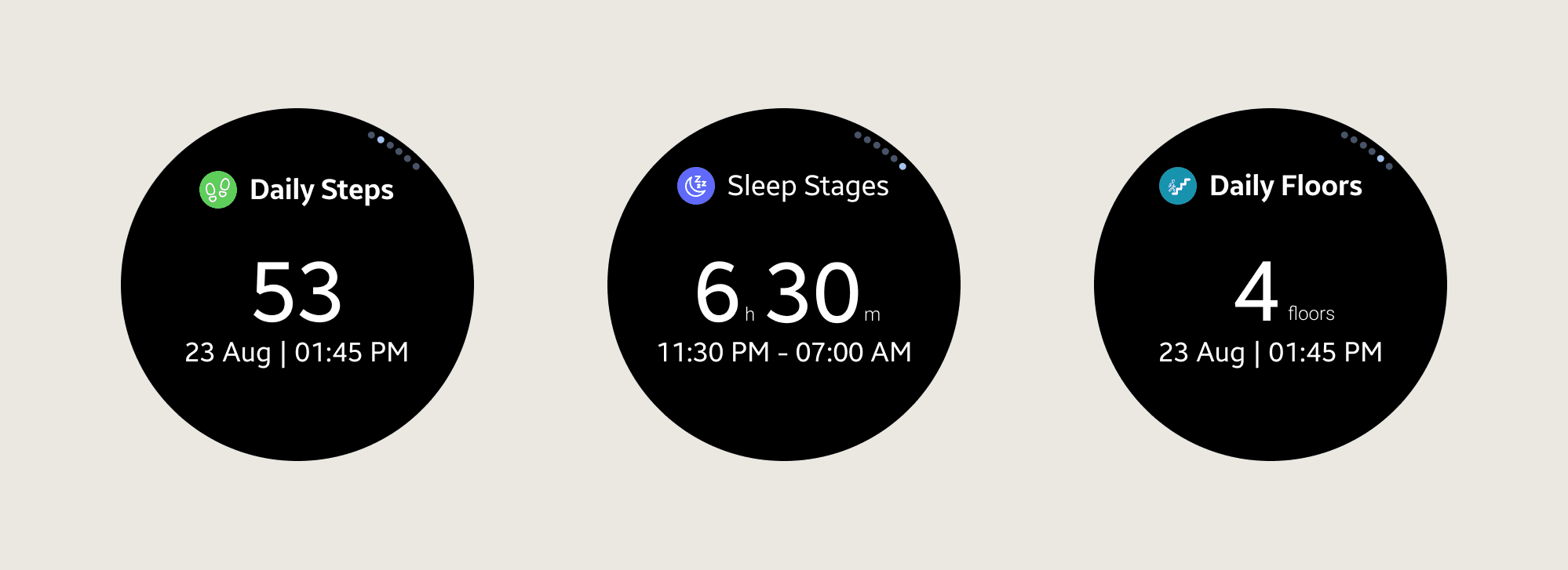
The Activity feature enables users to effortlessly track daily metrics like distance, steps, calories, floors, sleep stages, and fall detection. This comprehensive tracking ensures users have a complete overview of their physical activity, sleep patterns, and safety measures, empowering them to make informed decisions for their well-being.
Workout
The Workout feature offers 24 diverse workouts, allowing users to track duration, heart rate, calories, total sets, reps, steps, and distance for a comprehensive overview of their fitness activities.
Medication
The Medications feature offers a convenient medication reminder system, enabling users to set reminders for their prescribed medicines. This functionality ensures timely and consistent medication adherence, providing a valuable tool for users to manage their health effectively.
How are you feeling today?
My learnings
I learned how to design effectively for extreme screen constraints while following WCAG accessibility standards. This project strengthened my ability to prioritize information, simplify complex data, and balance user needs with technical and medical requirements through cross-functional collaboration.
Conclusion
The redesigned Harman RCP smartwatch app delivers a clearer, more accessible, and user-friendly monitoring experience. It helps patients stay engaged with their health while enabling doctors to remotely track progress and make timely care decisions, supporting better post-hospitalization outcomes.
Thank you!
You've reached the end...why not take a look at my other projects?