
FitBeet App
Prompt
A fitness enthusiast has just downloaded a new workout app called FitBeet and is eager to share their daily activity with friends. However, they've noticed that the app lacks a "Daily Activity" section. Seeking your help, they want to design a visually engaging concept to display their daily fitness accomplishments at a glance in the app profile. How would you create a feature that offers a quick overview of their daily activity for both personal tracking and sharing with friends?

About
FitBeet helps you move towards your fitness goals in an approachable way without taking away the fun. Users can earn points for completing activities, unlocking new features and lessons that will help them move along their fitness journey!
Timeline
Dec 2023 - Jan 2024 (3 weeks)
Sector
Health, Fitness
Design Role
Product, UX/UI, Research
Tools
Figma, Procreate, Illustrator, Photoshop
Goal
Infuse fun into fitness goals and promote healthy competition for an enjoyable journey to success.
What is FitBeet striving to achieve?
The prompt suggests that Beet desires his friends to witness his fitness activities, indicating a social aspect to the app. Beyond that, the prompt invites an open exploration of the app's concept.
Reach your step goal
60%
Drink 2L of water
45%
Take a 20 mins walk
45%
Daily missions
Keep it up!
I started by focusing on my design, asking: "What's the purpose of the Daily Activity
section, and how can we create an app that uses it to its fullest?"
What is the goal of the Daily Activity page?
Display and share your daily fitness activities with friends.
Offer a snapshot of your personal activities.
Introduce a social element to fitness for motivation, engaging users, and fostering continued app usage.
Facilitate friendly fitness competition among friends.
The Goal
After evaluating the app's objectives and the role of the Daily Activity feature, I determined that FitBeet ultimately aims to inject enjoyment into achieving fitness goals and cultivate a spirit of wholesome competition.
Solution
New year
fresh start
I'm fortunate to have FitBeet with me this time around...
My friends were impressed when they saw my daily activities on the app.
But I guess that’s to be expected when exercising is as fun as a game...

Making fitness enjoyable
FitBeet makes progressing toward your fitness goals easy and enjoyable. Users accumulate points by completing activities, unlocking exciting features, and accessing lessons to enhance their fitness journey!
Research
During my research, I concentrated on two primary areas. First, I investigated the fundamental metrics individuals often use in their fitness journeys. Second, I explored the potential of utilizing social interactions to enhance motivation within the fitness domain.

Key insights gathered from the online sources I compiled.
Insights
People use different metrics depending on their fitness goals, and counting steps stands out as the most popular form of competitive exercise. To keep users motivated, fitness apps often incorporate features like:
Online communities
Sharing workout routines
Fitness challenges
Awarding badges
Tracking and displaying stats over time to indicate progress.
Competitive Analysis
I made a list of features found in leading fitness apps on the App Store and took note of their distinctive attributes and overlaps through "blue" sticky notes. I focused on identifying common features among various fitness apps as it provided a solid foundation for determining the features to incorporate into FitBeet.

Ideation
Following an analysis of various fitness apps available, I experimented with three potential approaches to the Daily Activity page and eventually narrowed down my selection to one.
*Approaches
(1) Activity summary followed by activity feed (forum format)
(2) Activity summary followed by activity feed (image-forward social media format)
(3) Activity summary only

Gamifying fitness
The app's built-in social features naturally promote a sense of competition, and I capitalized on this by introducing streaks and points to cultivate a healthy and enjoyable competitive spirit. The layout is thoughtfully designed to minimize visual clutter, enhancing the user experience for easier and more efficient scanning.
User Research
Method: Survey, sorting
Every fitness journey is personal and unique to each individual.
Keeping this in mind, I carried out a survey using Google Forms with five of my active friends. I inquired about the features and metrics they would consider most beneficial for tracking their daily fitness activities.

The answers can be grouped into three main categories: Steps/distance, progression, and fitness metrics.
I also inquired if there was anything specific they would find interesting when exploring a friend's fitness profile, and I gained a valuable insight.
Fun motivation can arise from comparing stats with friends, and finding out about their usual workout routines proves to be a great source of inspiration.
Prioritizing and arranging features based on their significance and sequence.
Considering the following six features, a mix of elements drawn from competitor research:
Today's exercise activities with time
Timeline showing when activities were completed
Total exercise time
Top activity of the day
Overall progress (%) toward daily fitness goals
Findings
People prefer quick summaries of their friends' activities, valuing the ability to glance at key information
without spending much time. Because of this preference for summarized content, the timeline was found to be the least
valued feature in both assessments.
I had my 5 testers rank them in terms of importance. And in terms of the order they would want to see the features on a friend’s page (top to bottom):
Average placement of feature order based on responses

Feature order by individual response

Sorting features by importance offered clarity on which aspects to emphasize, while arranging them in a specific order shed light on preferences for page navigation. This process also underscored the varying levels of importance users associate with their own pages versus those of others.
Findings
People prefer quick summaries of their friends' activities, valuing the ability to glance at key information without
spending much time. Because of this preference for summarized content, the timeline was found to be the least valued
feature in both assessments.

Design

Wireframe to Lo-fi UI
Removing the timeline
I decided to eliminate the timeline as it was considered unnecessary information that users did not find valuable. Furthermore, it did not contribute as substantially to my main objective compared to the other features.

Refining the basic UI
Beet_the_fit
@beet_thee_fit
Bangalore, India
Joined Jan 2024
Designer
Tech @Intech
Instagram influencer
24
Day streak
3,140
Points
Friends
Daily Activities
Steps
Distance
4 m
Active time
2h 18m
8.2k
Steps
Gold Badge
10k League
Reach your step goal
60%
Drink 2L of water
45%
Take a 20 mins walk
45%
Daily missions
70%
Progress
11:39
Appearance
Added a burst of lively colors and incorporated plenty of rounded corners and squircles, creating a vibrant and modern aesthetic for an engaging page design.
+ Option to add and message friends too
Beet_the_fit
@beet_thee_fit
Bangalore, India
Joined Jan 2024
Designer
Tech @Intech
Instagram influencer
24
Day streak
3,140
Points
Friends
Daily Activities
Steps
Distance
4 m
Active time
2h 18m
8.2k
Steps
Gold Badge
10k League
Reach your step goal
60%
Drink 2L of water
45%
Take a 20 mins walk
45%
Daily missions
70%
Progress
11:39

Already mentioned in the other sections of the page
Daily missions + progress
"Daily Missions," previously known as challenges, has been merged with the overall daily progress toward hitting goals to eliminate redundancy. Positioned at the top of the page, users can now quickly view a summary of their friends' daily progress.
Logged Workouts
Steps
Distance
4 m
Active time
Before
2h 18m
8.2k
Steps
Gold Badge
10k league
Strength training
TOP EXERCISE OF THE DAY
25min
4 Exercise
Tap for details
Tap for details
Wing day
70 bpm
Heart rate
280 kcals
Burned
Cheerful Benchmarks
20min
889m
Running
2100m/24hrs
Total time
45 min

Steps
I changed the steps display to a progress circle, initially hesitant due to privacy concerns. Introducing the "Walking League" concept, users advance in their league with each step goal met, promoting continuous improvement and encouragement.
Logged Workouts
Steps
Distance
4 m
Active time
2h 18m
8.2k
Steps
Gold Badge
Keep it up!
Strength training
TOP EXERCISE OF THE DAY
25min
4 Exercise
Tap for details
Tap for details
Wing day
70 bpm
Heart rate
280 kcals
Burned
Cheerful Benchmarks
20min
889m
Running
2100m/24hrs
Total time
45 min
Top exercise + Cheerful Benchmarks
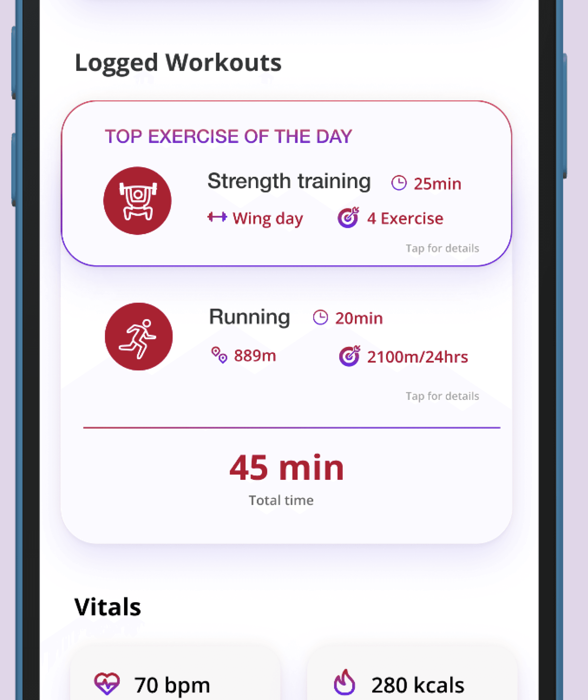
I removed duplicate information and repurposed the bottom section to highlight miscellaneous metrics. While these may not be the primary numbers users are most interested in, there is still a general appreciation for these additional metrics.
Final Screen
A breakdown of the design



Swipe right
Conclusion
Designing a single page proved to be an enjoyable learning experience, allowing for an in-depth exploration of every design choice. Unexpected ideas, like the introduction of the Walking League towards the project's conclusion, added a valuable element that helped bring the entire concept together seamlessly.
Lessons I learned
Peer feedback saved my project. Enlisting two designer friends for feedback proved invaluable as they questioned and challenged my design decisions, ensuring each choice had a solid rationale.
Storytelling the process enhances understanding. I invested extra effort in structuring the Figma file as a narrative, transforming the case study into an easily digestible story. This not only facilitated referencing but also made the design process more engaging and enjoyable.
That’s it folks!
Thank you!
You've reached the end...why not take a look at my other projects?

