MealMap
MealMap
About
A mobile app designed to help users achieve a healthier and budget-friendly diet. Through interactive lessons, MealMap teaches mindful eating, smart swaps, and meal prepping tactics.
Timeline
Jan - Mar 2024
Sector
Food, Health, Education
Design Role
Product, UX/UI, Research, Branding, Illustration
Tools
Figma, Illustrator, Procreate, Photoshop
Problem
It can be difficult to make healthy yet budget-friendly food decisions for a college student.
The Statement
College students face a challenge balancing a desire for healthier eating with tight budgets, struggling with the accessibility, affordability, and emotional stress of nutritious alternatives. This dilemma underscores the need for affordable and accessible healthy options, acknowledging the complexities of prioritizing rational health goals amid financial constraints.
Solution
Elevate your eating habits with MealMap
A mobile app designed to help users achieve a healthier and budget-friendly diet. Through interactive lessons, MealMap teaches mindful eating, smart swaps, and meal prepping tactics. Acquired knowledge becomes a lasting foundation, empowering users to make informed decisions about their food budgeting for a lifetime.
Research
PART 1 : Identifying opportunity
Method: Interview
To explore the common concerns among college students about their eating and spending habits, I devised a set of questions aimed at understanding their relationship with food and budget. Focusing on three key questions that promised valuable insights, I conducted 15-minute interviews with three students to delve into the intricacies of the problem space
How do you decide what to eat?
What does 'eating healthy' mean to you?
When do you choose to eat out or at home? What helps you decide, and how do you usually feel about your choice?
Why?
When making food choices, convenience tops the list as the primary factor, closely followed by considerations of nutrition
All interview participants highlighted that their choices were significantly shaped by time and convenience. Surprisingly, contrary to my expectations, they didn't express significant concern about their expenses
Findings
PART 2 : Understanding the problem
Method: Survey, interview, affinity mapping, persona, journey map
I wanted to check if the concerns were a big deal, so I did a survey with more students. I asked about what they think, do, and care about regarding food and money. After that, I interviewed three students to understand their problems better. In total, 18 students took part in the survey and interviews.


94% of students mentioned that restaurants are a significant monthly expense, and they want to cut down on eating out costs
Affinity Mapping
I organized the insights gathered from both the survey and interviews, sorting them into categories to identify common patterns and trends
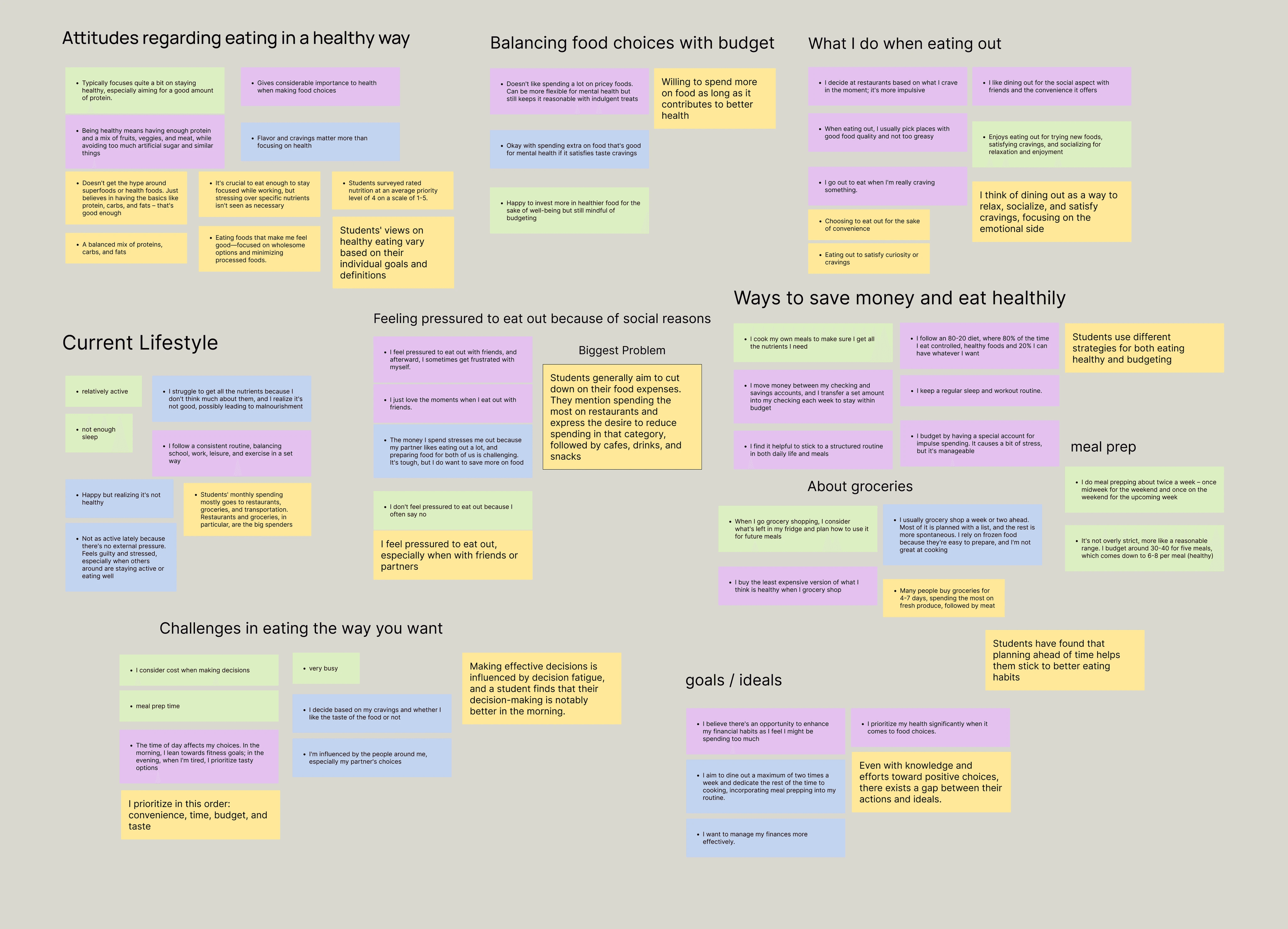
Social Motivations - Students often choose to dine out primarily due to social connections, convenience, and a sense of curiosity.
Priority on health - Students value food quality and health, showing a willingness to invest more in choices that contribute to their overall well-being.
Existing efforts - While most students employ strategies for their food and budgeting habits, they still find it challenging.
Findings
Transforming observations into ideas
I took the insights from my affinity mapping and explored the potential solutions.
HMW utilize social motivations to encourage healthier eating?
Turn cooking and meal planning into social activities, sharing groceries with friends for a collaborative approach.
Assuming they’re willing to spend more on healthy foods, HMW ensure they follow through with their plans?
Establish a meal planning system and incorporate accountability motivators (e.g., streaks, friends) for effective implementation.
HMW enhance their existing strategy to make it more effective?
Educate them on versatile strategies applicable to various situations (Selected)
After considering my various options, I found that the last one (Option 3) best suited my target audience. Given the time constraints of college students who can't entirely avoid eating out, I aimed for something adaptable to unavoidable situations.
Persona + Journey Mapping
Creating a persona proved beneficial as it provided a clear picture of the person I was designing for. To assist Aryan, I mapped out all his actions from pre-meal to consumption, identifying potential opportunities for support.
Meet Aryan


Competitive Analysis
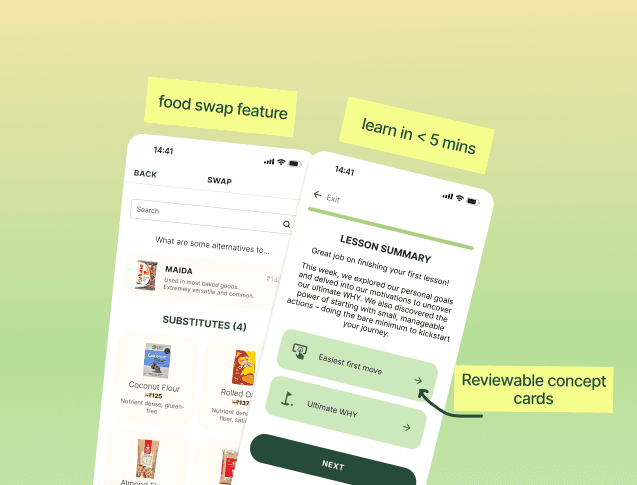
There is no shortage of apps that help you shop for budget-friendly groceries and creating a structured meal plan. But for students that do not have enough time and can’t avoid eating out, it may be better to teach them methods (e.g. food swapping) that they can apply in any scenario for a lifetime.

How would MealMap compare?
MealMap would assist users in achieving the goal of maintaining a healthy diet on a budget. It provides guidance through interactive means, incorporating tactics like meal planning and recipes, akin to the approach seen in Zest.
A simple and convenient commitment.
Students, being busy, need quick and easy habits. Short, easy-to-understand content and features with low commitment are crucial.
Ideation
I conceptualized the user journey, crafted a wireframe, and built a complete prototype, with each step accompanied by user testing for refinement.

*Customizing before signing up allows users to understand the app's advantages better, making them more inclined to create an account after investing time in the process.
The new user experience involves answering questions to tailor your app, signing up, reading your first lesson, and completing tasks to earn points for rewards.
*Customizing before signing up allows users to understand the app's advantages better, making them more inclined to create an account after investing time in the process.
Storyboard
Big picture storyboard was created by focusing on what the user needs, their context, and why the product will be useful to the user

Wireframes (User Testing)

I concentrated on onboarding personalization in this phase and sought early external opinions. I had three people explore the prototype independently to gauge their experiences.
I aimed to understand if:
1. The navigation felt intuitive.
2. They noticed any missing features or information that could be helpful.
3. How they felt throughout the process.
Takeaways
Positive
The carousel received positive feedback
The tester found navigation easy, enjoying the onboarding process.
Style Guide
Moodboard
I created moodboard that draw inspiration from organic elements and pastel tones, complemented by the elegance of modern fonts.
Colors
Drawing from the rich hues of nature's produce, my design blossoms with colors inspired by vegetables, adding a deliciously organic touch
fenugreek
#294D3B
#214232
#396B53
#969389
#5E5C58
#3A3936
#272725
capsicum
carrot
Charcoal
cauliflower
corn
tomato
charcoal
#DEDFD4
#B8DF98
#A2D38B
#619847
#FD9D78
#E86B3C
#D3653C
#F8E071
#F0C75B
#EF5552
#B04644
#FDFDFB
#FFFFFF
Typography and Buttons
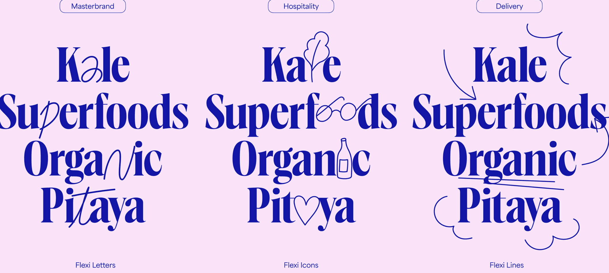
For the main heading, I opted for the Elsie typeface, known for its delicate, captivating, and personality-rich design. It seamlessly blends classic and contemporary features, exuding innovation and subtlety. As for the body text, I selected the Inter typeface for its readability and ease of comprehension.

Assets
I created playful avatars of veggies like capsicum, corn, carrot, and tomato to add a fun touch to the MealMap app. The idea is to make the user's journey enjoyable and accessible, sparking excitement as they begin their adventure with MealMap.
Take the quiz → Get started
Following testing feedback, I conducted a side-by-side comparison test using different text variations. I asked users to identify the option that made them most excited about using the app, and they selected "get started."

Navigation bar
I mistakenly assumed that users would naturally understand each page's purpose over time. By adding text alongside the icons, navigation becomes significantly more user-friendly for newcomers.
Home
Swap
Reward
Account
Log

Designing for context
In the context of health and education, my primary challenge was selecting words that conveyed information in a clear, thoughtful, and easily understandable manner. For instance, opting for "change weight" over terms like "diet" or "lose weight."

Final user testing

I took a final step back from my own design and had three new testers go through the hi-fidelity prototype.
I asked testers to share what they understood about MealMap to check if the onboarding gave enough info.
I inquired if there was anything they found unclear or confusing.
Takeaways
Positive
Users understood the purpose of MealMap well.
Moving from weekly lessons to learning whenever suits you.
Initially, I set up a weekly lesson structure to provide users with a specific target and timeline.
Aryan's input highlighted that I was designing for busy college students. Upon reflection, I reconsidered the product decisions. I replaced the weekly lessons with ones that users can take at their own pace.
This way, I can promote commitment without putting undue pressure, allowing users to set their own goals and proceed as they prefer.
Taking Your First Step
Get started
aryan
0
Nothing yet.
14:41
Not started
8 min
Lesson
Backpack
Homework
Week 1
2
Write down your ultimate WHY
1
Log your emotions once
Concept Cards
Minimum Viable Action
Ultimate WHY
Skill mastery
Goal setting
MVA
Mindfulness
Minimum Viable Action
Ultimate WHY
Concepts
Skills
Goal setting
MVA
Begin with your first move
Restart
Home
Swap
Reward
Account
Log

Taking Your First Step
Get started
aryan
0
Nothing yet.
14:41
Not started
8 min
Lesson
Backpack
Homework
Week 1
2
Write down your ultimate WHY
1
Log your emotions once
Concept Cards
Minimum Viable Action
Ultimate WHY
Skill mastery
Goal setting
MVA
Mindfulness
Minimum Viable Action
Ultimate WHY
Concepts
Skills
Goal setting
MVA
Begin with your first move
Restart
Home
Swap
Reward
Account
Log
Final Hi-Fi Prototype
Onboarding
Engaging and playful onboarding
Lessons
Understand and apply the concept
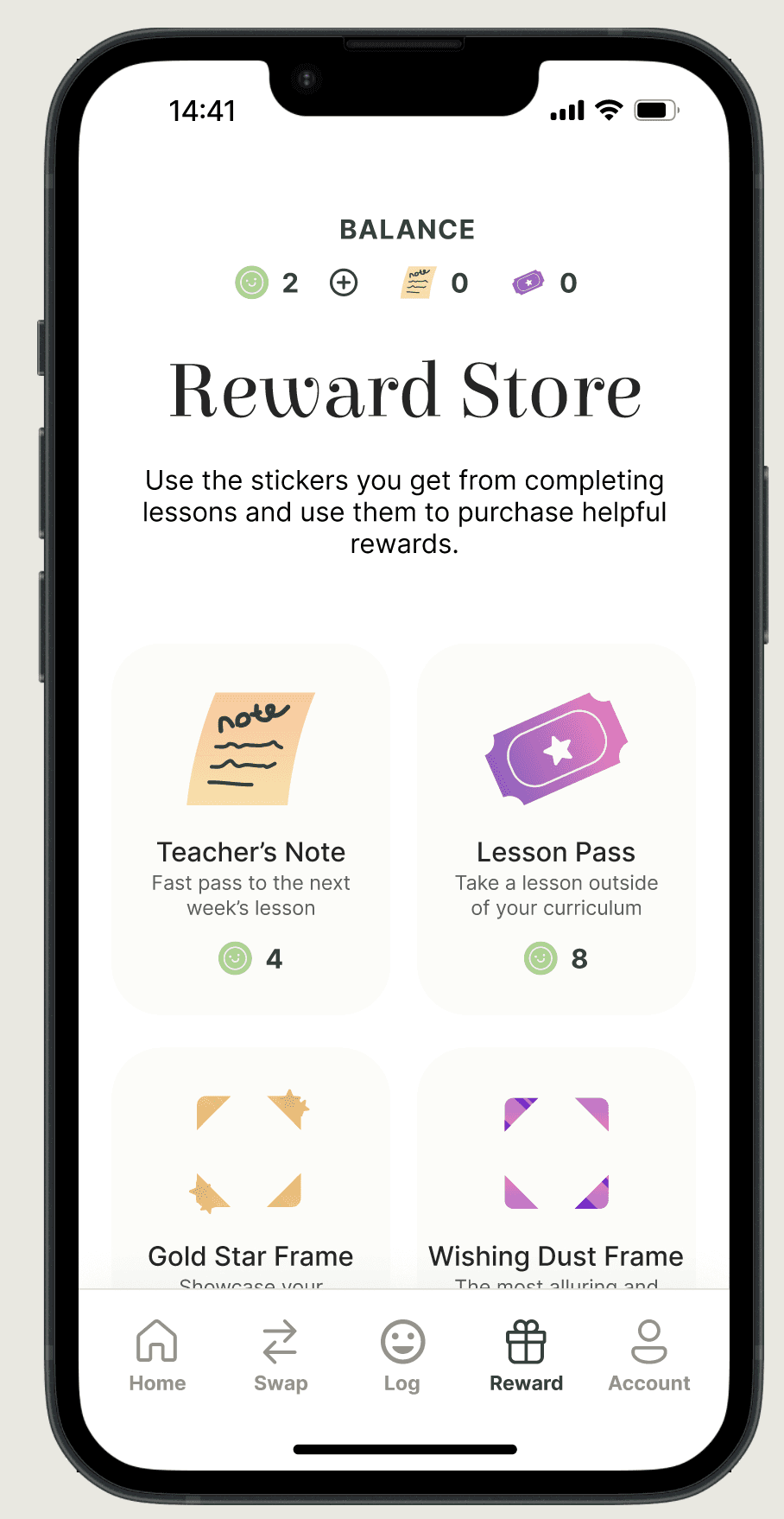
Reward Shop
Complete tasks, get rewards
Log
Feel more positive about your decisions
Food Swap
Find better food alternatives

Prototype link
Conclusion
Lessons I learned
Getting help is good! Another person's viewpoint really helps in finding small mistakes I missed. Picking the right words can be tough, just like picking a design. Every choice, like tone, color & shapes, builds your brand identity.
An area I aim to improve
I want to improve how I do research. The people I interviewed first were mostly my friends, so it wasn't a big and diverse group. Although they shared great insights, it would have been better if I talked to more people with different perspectives.
Moving Forward...
I aim to make every page full of features and add interaction. I want to test with more users to see what they like in other apps & create a sample plan to check if MealMap's method really works well.
Thank you!
You've reached the end...why not take a look at my other projects?


colors inspired by vegetables

Fun illustrations
Interactive carousel
Answer a few questions
to personalise your MealMap
experience to best fit your needs.
GET STARTED
Learn at your own pace
and stay engaged with
interactive lessons
SHORT AND DIGESTABLE
Follow-up the lessons
with homework (simple tasks)
to accumulate skill points
and earn stickers
TURN CONCEPTS
INTO SKILLS
The currency can be
earned from completing
homework and lessons.
Not enough stickers?
You can purchase them too!
STICKERS
To supplement your learning.
PASSES
For the skills you have earned.
FRAMES
The logging feature
encourages users to
become aware of their
meal decisions and how
it felt.
This is measure is
their success!
MINDFUL ACTIONS
Search across a
database of foods and
their alternatives.
Brief description and price
range sampled across stores
ITEMS BEING LOOKED UP
See how the price compares
Note on nutrition
SWAPABLE FOODS
Work on
"Engage in the Quiz" made users feel like they were undergoing an assessment; focus on refining language.
The purpose of the nav-bar icons was not easily understood.
Provide clarity on the structure of the lessons in the product.
Work on
I'm a little confused on whether the lessons are weekly and if I need to commit. I find it hard to commit to things even when it's at your own pace so the non-commitment features such as swap and logging appeal to me. - Aryan