
Harman Remote Care Platform (RCP)
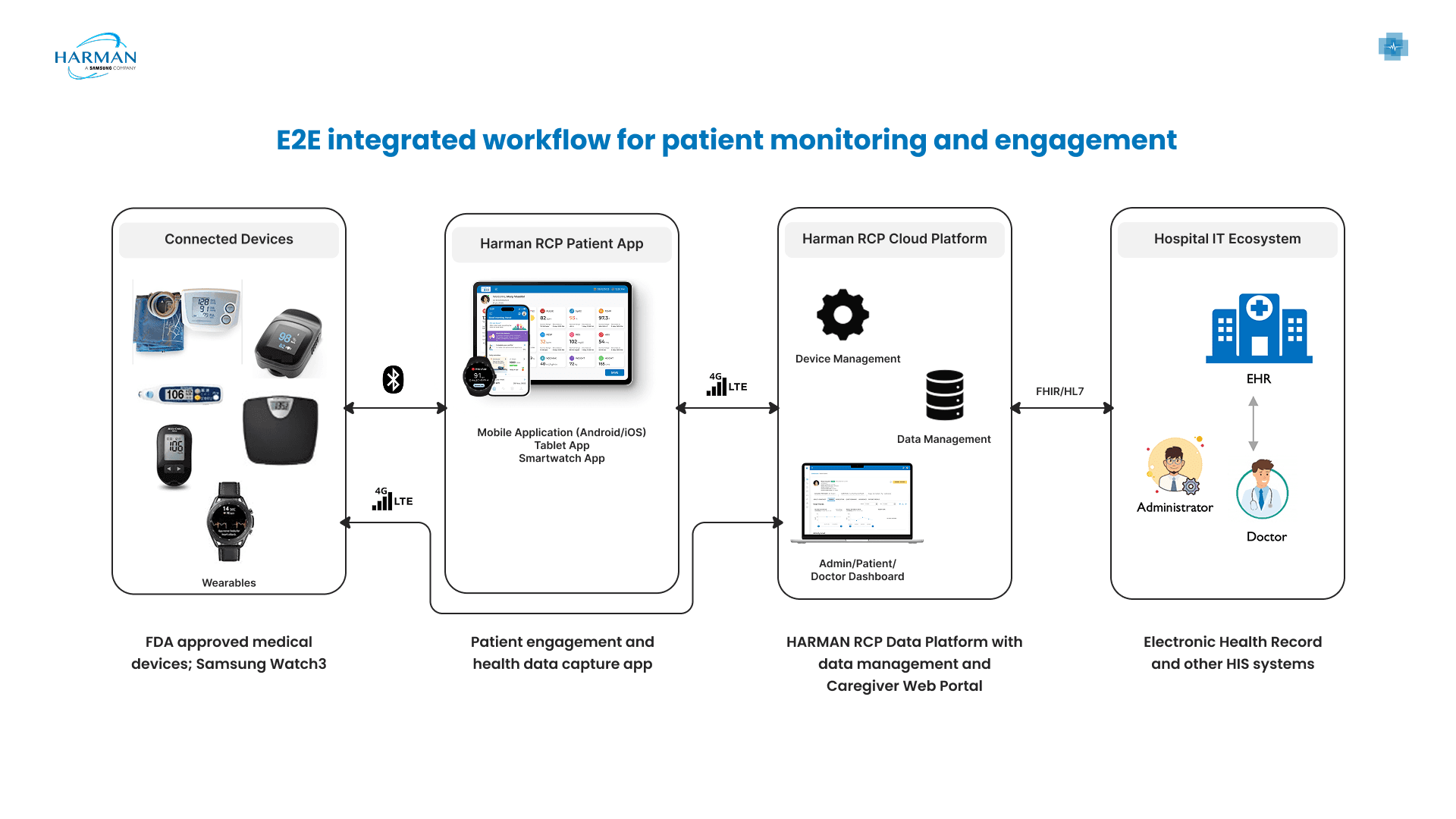
HARMAN RCP CARE is a Remote Patient Monitoring platform that tracks patient health using advanced biometric devices and wearables. It helps care teams access and visualize patient data regularly, ensuring continuous monitoring outside the clinical setting

My Role
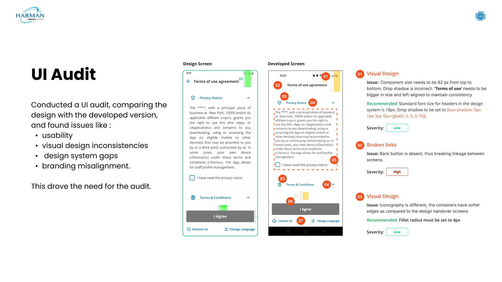
I worked as a UX Designer, focusing on understanding the problem, translating data and research insights into design solutions, and designing new features across mobile, tablet, wearables, and desktop. I collaborated closely with product managers and engineers, participated in user testing sessions, iterated on designs based on feedback, taking UI Audits and ensured visual consistency and usability across platforms. I also guided a design intern during execution and reviews.
Timeline
Jul 2023 - June 2024
Team
Sector
Healthcare
Tools
Figma
Impact
Reduced time to access critical patient information through improved information hierarchy and workflow-driven layouts
Lowered cognitive load during daily monitoring by simplifying complex health data
Improved cross-platform consistency using scalable UI patterns, enabling faster iteration and reduced rework
Enhanced accessibility and readability, supporting sustained use by healthcare providers
Challenges
HARMAN RCP CARE supports patients through wearables, mobile apps, and tablets, while healthcare providers monitor data on desktop. Patient data and actions were spread across devices, which made the journey feel confusing at times. Some features were not intuitive, and users needed extra effort to understand what to do next. Large amounts of health data also increased mental load during daily use. Based on provided data and user testing sessions, we identified gaps in the flow where patients faced difficulty completing tasks smoothly.
Results
New features and journey improvements made the app easier for patients to understand and use across devices. Key flows became clearer, reducing confusion during daily health tracking. Feedback from user testing helped improve clarity, navigation, and overall ease of use. For healthcare providers, desktop improvements aligned better with monitoring needs, making patient data easier to review. Overall, the changes improved usability, reduced effort, and created a more intuitive experience for both patients and care teams.
Constraints & Considerations
Designed new features within an existing product ecosystem across wearables, mobile, tablet, and desktop.
Worked within strict screen-size limitations, especially on wearables, requiring clear and space-efficient information design.
Handled evolving requirements as insights emerged from data analysis and user testing, leading to early-stage ambiguity.
Collaborated closely with product managers and engineers to balance usability, technical feasibility, and healthcare workflows.
Design Platform

How it works?
my contribution
Service

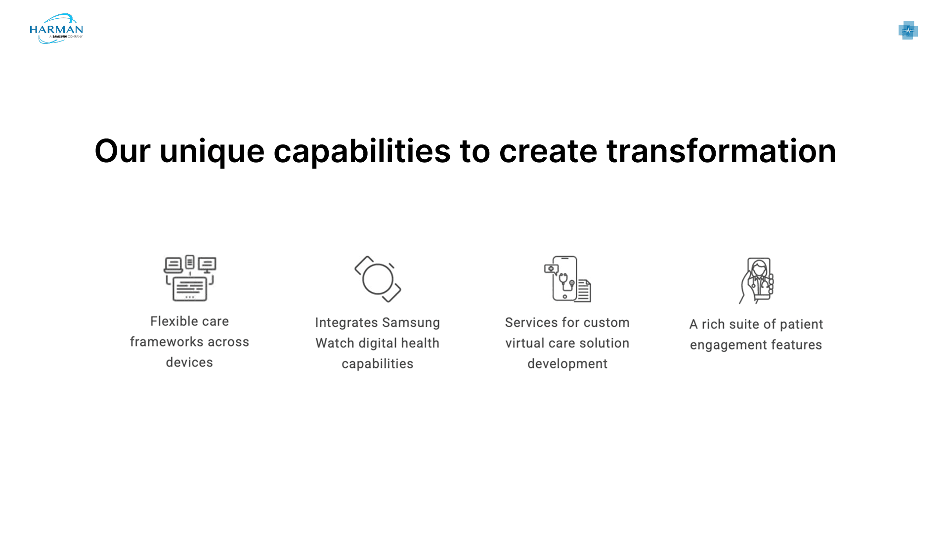
Vision

UI Design Guidelines

Mobile Screens
RCP is a user-friendly healthcare app that lets you quickly enter information while multitasking. This document outlines market needs and user patterns

Careplan Adherence — A Representative Example
There was a need to design a Careplan Adherence experience that helps elderly users easily understand how well they are following their prescribed care plan and clearly guides them toward the next required action.
Context & Problem Statement
Product context
This is a remote care patient (RCP) app.
Target users are elderly patients, many with:
Chronic conditions
Limited tech familiarity
Anxiety around medical data
Core problem
Patients were not consistently following their care plan, and when they checked the app:
They felt confused
They didn’t know whether they were “doing well”
They didn’t know what action to take next
This directly affected:
Trust in the app
Long-term health outcomes
Users & Constraints
Primary users
Age: 60+
Possible limitations:
Low vision
Slower cognitive processing
Fear of “doing something wrong”
Difficulty understanding medical terms
Emotional state
Health apps can create stress
Users want reassurance, not judgment
Constraints
Must follow WCAG accessibility
Must feel medical but friendly
Cannot overload users with analytics
Must work for users with basic smartphone skills

3. Detailed Requirements
3.1 Product Requirements
The screen must:
Show overall careplan adherence
Explain what contributes to that adherence
Highlight what is missing
Encourage users to complete pending tasks
Work across different time ranges (daily / weekly)
3.2 UX Requirements
The experience must:
Answer 3 questions within 5 seconds:
How am I doing?
Why is my score like this?
What should I do now?
Reduce:
Cognitive load
Fear and anxiety
Increase:
Confidence
Sense of progress
3.3 Accessibility (WCAG) Requirements
Explicitly considered:
WCAG 1.4.3 – Minimum contrast (text & visuals)
WCAG 1.4.4 – Text resize up to 200%
WCAG 1.3.1 – Information not dependent on color alone
Large touch targets
No hidden or complex interactions
4. Assumptions & Research Inputs
Inputs considered:
Feedback from care teams
Industry research on elderly usability
Observations from similar healthcare apps
Key insights:
Elderly users prefer summary over detail
One clear number is better than many metrics
Red color without explanation causes anxiety
Users want clear guidance, not interpretation

Takeaways
Positive
Users understood the purpose of MealMap well.
Provide clarity on the structure of the lessons in the product.
Work on
I'm a little confused on whether the lessons are weekly and if I need to commit. I find it hard to commit to things even when it's at your own pace so the non-commitment features such as swap and logging appeal to me. - Aryan
User Feedback
Positive
"I like seeing one number, it's comforting"
"I don't understand all these percentages"
"Which part is more important here?"
"What should I do next?"
"I need this to be explained in a simpler way"
"Is this data for today or whole week?"
Work on
6. Final Design (Why This Screen Works)

Takeaways
Positive
Users understood the purpose of MealMap well.
Provide clarity on the structure of the lessons in the product.
Work on
I'm a little confused on whether the lessons are weekly and if I need to commit. I find it hard to commit to things even when it's at your own pace so the non-commitment features such as swap and logging appeal to me. - Aryan
Impact & Success Metrics ✌️
Reduced confusion during usability testing
Improved task completion
Increased confidence among elderly users
Fewer support queries about "what does this mean?"
While the platform includes multiple workflows and screens, the Careplan Adherence screen is presented here as an example to illustrate the design approach, decision-making process, and accessibility considerations applied across the product.
Mobile design screens
Vitals Measurement
The Vitals Measurement feature lets patients track key health metrics easily, monitor trends, and share accurate data with their care team for better daily health management.
Daily Activity
The intent of the Daily Activity feature is to help patients stay aware of their movement and activity levels throughout the day, encouraging healthy habits while supporting recovery and long-term wellness through continuous, easy-to-understand tracking.
Desktop design for Healthcare providers
RCP Web Portal is an intuitive app for quick data entry, integrated with the HARMAN RCP Data Platform and Caregiver Web Portal

Health Snapshot — A Representative Example
There was a need to design a Care Plan Adherence screen that clearly surfaces patient adherence status while reducing the effort required to review complex health data.
Context & Problem Statement
Product context
This screen is part of a remote patient monitoring platform designed for elderly-focused care programs.
It is primarily used by:
Care teams and healthcare providers to monitor patient health remotely
Elderly patients, whose health data is passively collected through wearables
The experience supports care teams in:
Quickly assessing overall patient status
Identifying potential risks or non-adherence
Taking timely action without cognitive overload
Core problem
Care teams needed an intuitive way to review patient adherence and health trends in one place without navigating multiple screens or interpreting dense, table-heavy data especially during time-sensitive clinical reviews.
2. Requirements
Functional Requirements
Display the latest vitals and activity data in a single view
Surface historical trends to identify patterns over time
Support multiple health parameters (steps, sleep, heart rate, calories, etc.)
Support date range filtering
Ensure medical accuracy and data reliability
UX Requirements
Enable quick scanning during busy clinical workflows
Reduce cognitive load when reviewing dense health data
Avoid alarming or misleading visual cues
Maintain visual and interaction consistency across parameters
Support elderly-focused care contexts
Follow accessibility best practices (WCAG)
3. Key UX Challenges
Large volumes of heterogeneous health data
High risk of information overload during routine monitoring
Different health parameters requiring different levels of emphasis
Balancing medical accuracy with visual clarity
Avoiding anxiety-inducing cues for borderline or non-critical values
Must follow WCAG accessibility
Design system consistency
4. Ideation

Why the List View Didn’t Work
Care teams found it difficult to review patient data presented in a long list
The layout felt similar to an Excel sheet with excessive numbers and dense rows
Important information did not stand out visually
Reviewing the screen took more time and increased cognitive effort
Overall, the experience felt less intuitive for frequent, quick check-ins
Why the Card View Performed Better
Information was visually grouped, making it easier to scan
Key metrics were highlighted using size, weight, and spacing
Reduced visual noise by separating data into meaningful sections
Enabled care teams to quickly identify what mattered most
Felt more aligned with real-world monitoring workflows
User Feedback
Positive
“The card layout makes it much easier to scan the patient’s status.”
“I don’t feel overwhelmed by numbers anymore.”
“Important information stands out, so I know where to look first.”
“This feels faster to review during my daily checks.”
“I still have to read a lot of text to understand each card.”
“It would help if I could recognize the type of data instantly.”
“Some values take a moment to understand without visual cues.”
Work on
5. Final Design (Why This Screen Works)

Impact & Success Metrics ✌️
Reduced time to scan and understand patient data
Lower cognitive load by replacing dense tables with card-based summaries
Faster identification of critical values through bold typography and color highlights
Improved clarity of key metrics (bpm, steps, calories, activity time)
Increased usability confidence among care team members
Better alignment with clinical workflows and daily review patterns
Established a scalable card pattern for other sections of the platform
While the platform includes multiple workflows and screens, the Health snapshot screen is presented here as an example to illustrate the design approach, decision-making process, and accessibility considerations applied across the product.
Desktop Design Screens
Login Screen

Dashboard Screen

Health Snapshot & Vitals

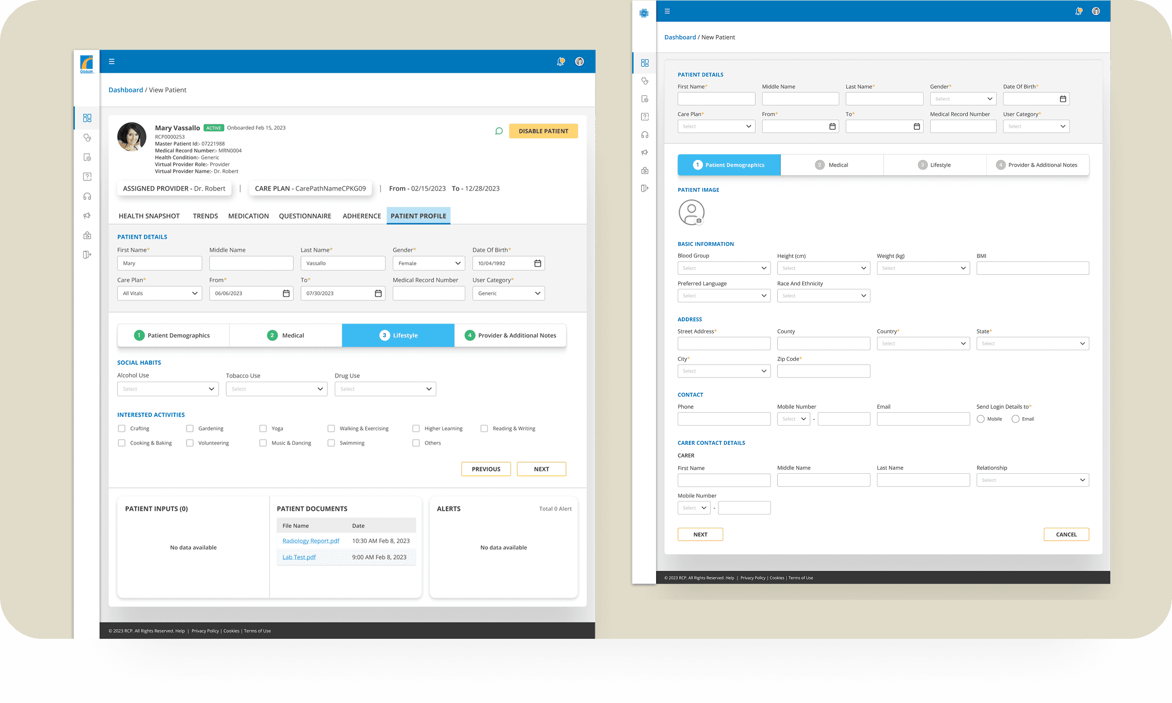
Patient profile
Tablet design
RCP is an easy-to-use healthcare app for tablets, letting users quickly enter information while multitasking. This document covers the market needs and user habits for tablet users.



Insights
User testing and data analysis showed that patients needed clearer guidance and simpler flows to complete daily health
tasks with confidence. Information worked best when it was broken into small, meaningful steps across devices.
For healthcare providers, quick access to the right data mattered more than showing all data at once.
Consistency across platforms helped reduce confusion and improved trust in the system.
My learnings
I learned how to design within real product constraints, especially for healthcare use cases where clarity and accuracy are critical. Working with multiple platforms strengthened my ability to prioritize information and adapt designs to different screen sizes. Regular collaboration with PMs and engineers helped me improve decision-making and balance user needs with technical feasibility.
Conclusion
This project strengthened the overall patient and healthcare provider experience by making new features more intuitive and workflows easier to follow. Through data-driven decisions, user testing, and cross-functional collaboration, the platform became clearer, more consistent, and better aligned with real user needs.
Thank you!
You've reached the end...why not take a look at my other projects?

